Government Writing and Design Services
Home »
Since 2000, our specialist writers and designers for government have worked on 500+ state and commonwealth government annual reports, brochures, reports, press/media statements, inquiries and fact sheets.
Government graphic design solutions
Our government graphic design solutions communicate information in the most legible and engaging way. Every element on every page has a clear purpose – to communicate your message clearly in a way that’s visually appealing.
Government documents and reports should never say, ‘Look at me.’ They should say, ‘Look at this’. Every design element on every page needs to inform and engage. Our crisp, clear, attractive government design will reinforce your brand.
We can also animate your results and statistics with uncluttered, easily digestible and artful infographics, charts, tables and icons.
- Represent you at your best
- Intelligently combine authority, emotion and reason
- Be on-brand and on-message
- Be professionally project managed using our well-tested project management methodology
- Be accessible
- Have at least two cover page and layout options
- Contain well produced video/animation and infographics if required
- Give you the option to have us organize printing
Plain English government editorial services:
Put simply or, dare we say it, plainly, plain English is writing something in a way that gives someone a good chance of understanding it on the first reading, and in the way you want them to. A good government writer uses clear, direct writing, with as few words as possible, avoiding ambiguity, verbiage and complex sentences.
What looks like a simple and effective message, is usually the product of long and careful crafting. For a government writer this process is impossible without a sound grasp of language from the ground up. So whether it’s copywriting from scratch, a light edit, or major surgery involving a complete rethink of an existing document, we’ve got you covered. We’ll craft your government document into a leaner, cleaner and more concise message that can be understood and acted on after one reading. Of course, while editing, we’ll rigorously maintain the original meaning and intent, and never change facts or figures.
Together our design and editorial services will make your government document the most effective it can be.
- Annual reports
- High profile government reports
- Websites
- Fact sheets
- Case studies
- Speeches
- Newsletters
- Brochures and flyers
- Internal communications
- Press releases much more
Inquiry Into The Victorian On-demand Workforce
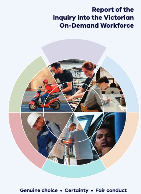
APM plain English edited and graphic designed the 200,000 word Inquiry into the Victorian On-Demand Workforce.
The Victorian Government commissioned Inquiry, released mid 2020, was a response to concerns about the wages and conditions of workers in the on-demand or ‘gig’ economy. APM worked with commissioned research, submissions and rough chapter drafts prepared by the Department of Premier and Cabinet. In addition to copy and design support, APM advised on structural changes to ensure the recommendations were clearly and logically expressed.
Our design approach to this document (and all government reports) is to create a document that is visually accessible. In a report where text predominates, it’s important to ensure there is visual relief. Infographics, break-out boxes, tables, graphs and other graphic elements in the Inquiry report provided statistics at-a-glance, directed the reader to important points of interest, and conveyed the core content of the report in a ‘readable’ format.
APM’s rigorous project management methodology ensured all editorial and design requirements were delivered on time and that the project ran smoothly.
Emergency Management Victoria
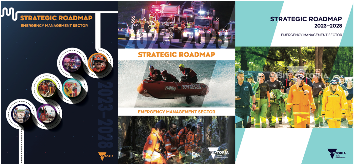
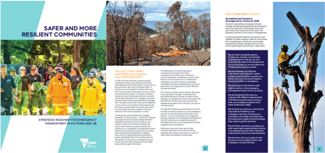
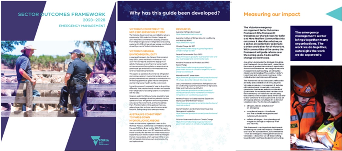
APM wrote and designed a suite of four strategy documents for Emergency Management Victoria.
Emergency Management Victoria
Safer And More Resilient Communities
Sector Outcomes Framework
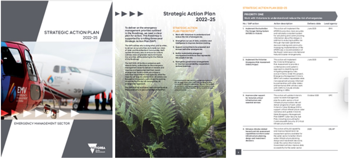
Strategic Action Plan
Design and layout: The design was clean with compelling visuals, ensuring a logical flow of information. This approach balanced visual appeal with the clarity and efficiency of information presentation was suitable for the diverse audience.
Visual connection and style: We adopted a minimalist triangle graphic to visually connect the documents as a suite.
Visual connection and style: We adopted a minimalist triangle graphic to visually connect the documents as a suite.
Plain English: The document suite was written for government and non-government agencies, the broader Victorian community, community groups, volunteer organisations, and stakeholders in the sector.
Content focus and language: The documents acknowledged past challenges while emphasising a forward-looking approach with positive outcomes. All clearly outlined strategic priorities, plans for achieving them, and expected outcomes in plain English.
Inclusivity: The written content was inclusive and representative, reflecting the diversity of Victorian locales, genders, and ethnicities. Our plain English also enhanced readability and understanding for the broad audience.
Department of Education and Training (DEET)
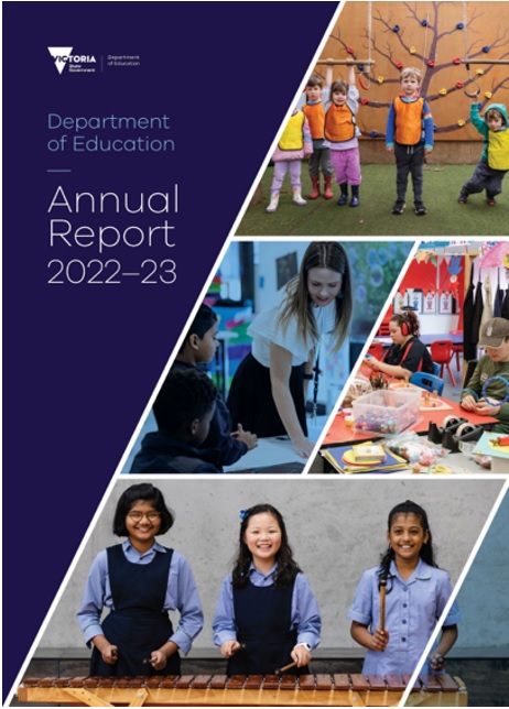
Plain English editing and writing 150,000+ words across four annual reports.
APM has been providing plain English editing and design services to the Department of Education and Training (DEET) since 2003.
- The Department itself
- Victoria Registration and Qualification Authority
- Adult Community and Further Education Board
- AMES Australia
Our focus was to enhance clarity, ensure logical flow, maintain consistency with the department’s style guide, and 100% accuracy in spelling, grammar, and punctuation. We aimed to convey the department’s central messages and address stakeholder concerns effectively and bring the appropriate, consistent tone across all four documents.
Museum of Australian Democracy
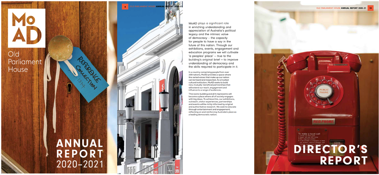
Design style: The Old Parliament House annual report was given a clean, contemporary design style, aimed at enhancing comprehension and navigation.
Layout and structure: The layout was carefully structured, with distinct sections highlighted by ample white space and crisp design elements.
Data presentation: Infographics and charts were used to make complex data more digestible and understandable.
Colour scheme and imagery: The colour scheme was chosen to be understated yet meaningful, reflecting the institution’s prestigious legacy. High-resolution images, illustrative maps, and data visualisations were strategically placed to punctuate the narrative and break up the text, adding visual interest and supporting the report’s content
Content collation and editing: APM managed and edited various types of copy supplied by the Museum, including stakeholder reports, forms, press releases, and ongoing communications, employing plain English for clarity.
Stakeholder engagement: The team conducted interviews with key stakeholders and wrote the CEO’s letter, offering content advice and strategic communication guidance throughout the process.
Narrative: The final copy was logically organised, enhancing the clarity and engagement of the Museum’s annual story, elevating it to a new level.
Business Victoria
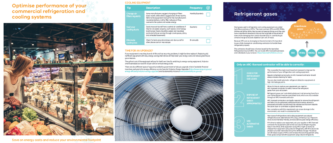
APM wrote and designed a brochure advising people how to optimise commercial refrigeration and cooling system performance.
- Plain English editing ‘real life’ copy
- Grammar and punctuation refresher
- Passive and active voice transitions
- Removing unnecessary words
- Writing for your audience
- To jargon or not to jargon and much more
Visual appeal and layout: APM’s clean, modern design and intuitive layout, enhanced the guide’s professional appearance and making its complex subject matter more approachable.
Use of graphics: Incorporated relevant graphics and icons to visually represent key concepts, aiding in the reader’s comprehension of technical topics.
Consistent branding: The consistent application of the Victorian government’s branding guidelines, contributed to the brochure’s credibility.
Accessibility considerations: We designed the guide with accessibility in mind, making it easy to read and navigate for a broad audience, including those with visual impairments.
Plain English: The Department of Jobs, Skills, Industry and Regions required APM to simplify technical jargon related to refrigeration gases, energy use, and maintenance for a diverse audience.
Comprehensive content: The guide covered essential topics such as greenhouse gas emissions, maintenance tips, and legal requirements, ensuring a holistic understanding for the reader.
Engagement and structure: APM maintained reader engagement with well-structured content, logical flow, and relevant headings, allowing for easy navigation across the guide.
Compliance with standards: Adhered to Australian spelling and grammar standards, reinforcing the professional tone suitable for a government publication.
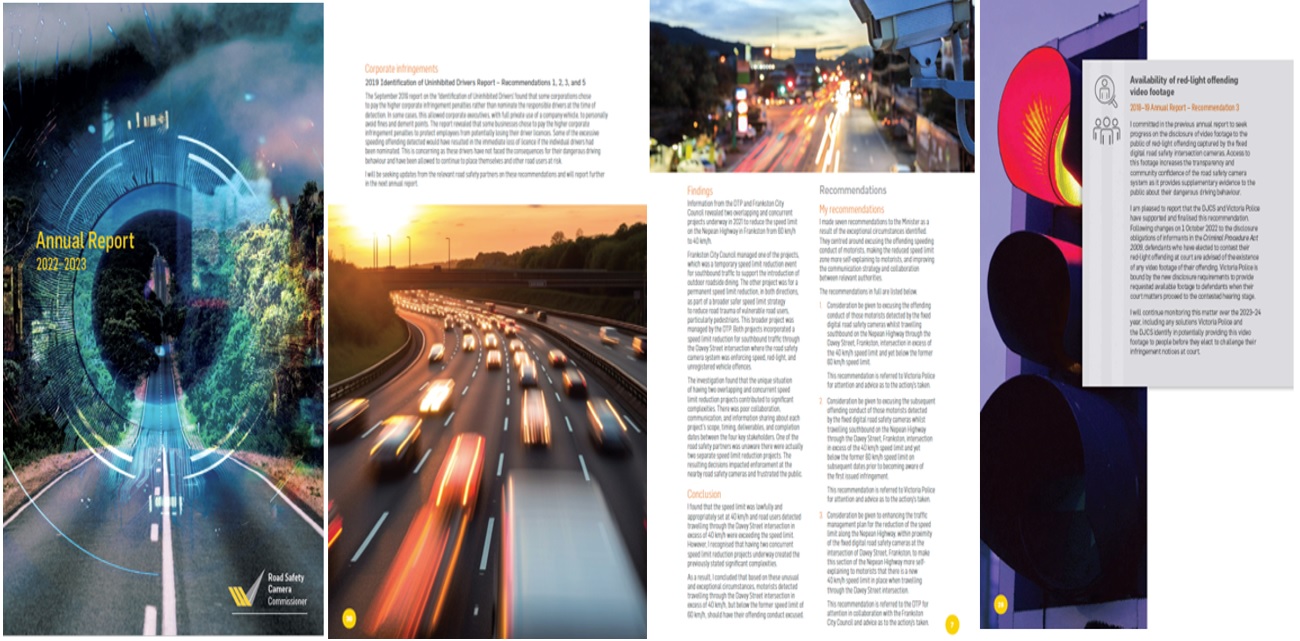
The Victorian Office of the Road Safety Camera Commissioner Annual Report
Design philosophy: The design emphasises readability and accessibility, aiming to complement the Office’s authoritative voice.
Visual elements: Infographics, charts, and other visual aids are integrated to transform complex data into understandable and memorable graphics.
Design functionality and impact: Visually appealing and easy to navigate layout engages stakeholders. The design approach ensures that the report serves as a vital tool for informing and educating the public about the Office’s initiatives and achievements.
Compliance with standards: APM has consistently delivered high-quality graphic design services that meet the stringent standards of government reporting, demonstrating our ability to adhere to the specific needs of government entities.
Project background: APM has designed and written the past four annual reports for the Office of the Road Safety Camera Commissioner.
Content and communication goals: We’ve focused on creating four annual reports that accurately conveys critical road safety data and insights. Each one has been designed not just as an information repository but also as a testament to the Office’s dedication to transparency and accountability.
Agriculture Victoria
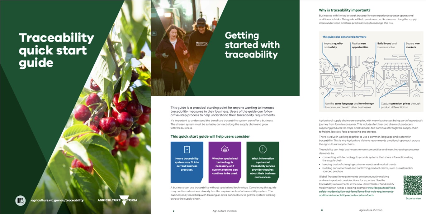
Using plain English, APM was engaged by Agriculture Victoria to clearly explain the concept of “digital traceability in food and fibre” to farmers, producers, and governmental bodies.
Our team wrote a comprehensive suite of materials, including fact sheets, brochures, web content, and case studies, all designed with clarity and ease of understanding front of mind. A thorough project plan was established to effectively manage workflow and deadlines. Regular coordination with the program manager and team ensured alignment with the program’s objectives. We engaged with project leads and stakeholders through consultations and did our own targeted research to refine our approach. APM also created infographics to communicate critical information effectively. The outcome was an educational set of documents and graphics succinctly conveying complex concepts in digital traceability to the target audience.
CSIRO
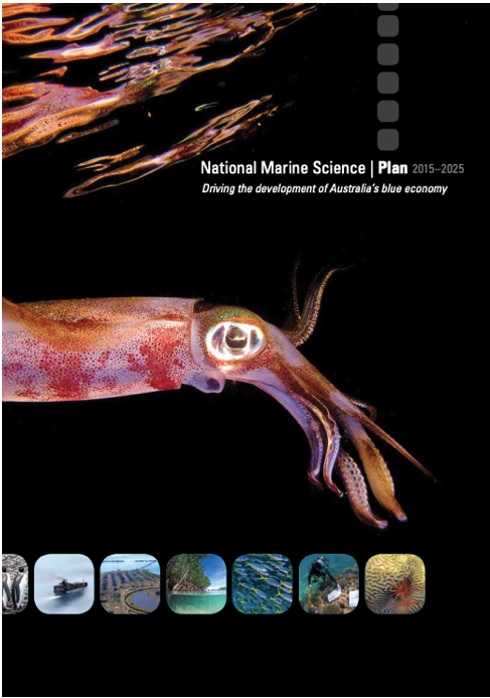
The update of CSIRO’s National Marine Science Plan (2015–2025) brought together the knowledge and experience of Australia’s marine research organisations, universities, industry and government, as well as more than 500 scientists.
- Remove Any Undue Repetition And Factual Contradictions
- Improve flow and continuity of tone
- Smooth-out the language to enable access for a broad audience
- Improve the organisation and content
- Clarify meaning
The result was a document that maintained scientific integrity without sacrificing accessibility.
New South Wales Aboriginal Land Council (NSWALC)
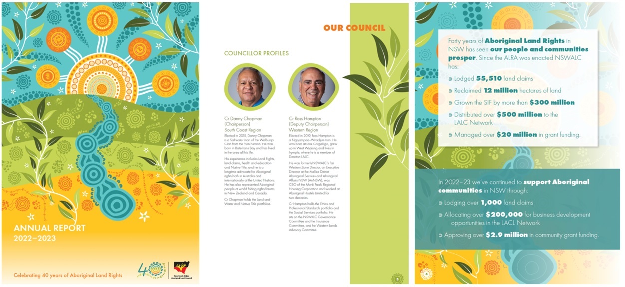
The high level of professionalism we bring to writing, design and project management is what keeps NSWALC coming back.
Each year, APM’s design for NSWALC’s annual report has sought to showcase Aboriginal culture and heritage. Colour palettes, typography and design elements were chosen to reflect the Aboriginal landscape and traditions. Using elements of Aboriginal art to create graphics and icons, and sourcing appropriate stock imagery, we’ve taken the design of the report from simply meeting statutory requirements to becoming the flagship of the organization.
APM organised the structure of the report and the information for each section to achieve a sequential flow of content. Both structural and plain-English copy editing were required on supplied text. This included rationalising repetitive information to form section introductions and overviews while ensuring a consistent, clear voice throughout. We also created copy from primary sources and interviews, including with the Chair and the CEO.
Red And Blue Books For The Victorian State Election
Prior to each Victorian State election, government departments prepare an incoming government brief for both the Liberal Party (known as the Blue book) and the ALP (the Red book), reflecting advice on the challenges facing the state, as well as the known priorities of the new government.
The party that forms government receives its book, while the other is pulped. APM proofread 250,000 words for red and blue books for Victorian Government departments. The highly confidential nature of the information required APM employees to be security checked and NDAs to be signed. The job was delivered within a very tight time frame and to the great satisfaction of our regular client.
Happy Clients